
Verjen
As a pioneer in the production of extra virgin oils in Iran, Verjen decided to expand its product portfolio by introducing a line of flavored olives.
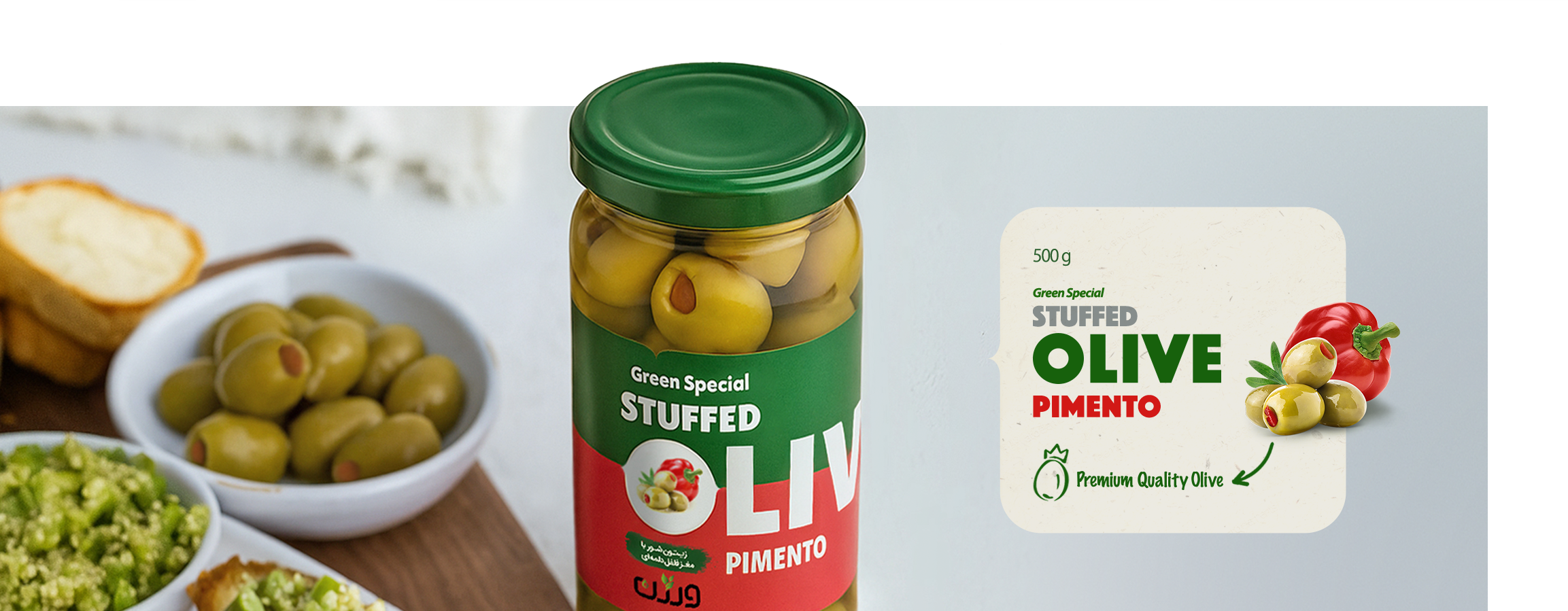
This project was an opportunity to reimagine the packaging in a modern, professional format aligned with the brand’s spirit. The goal was to create a fresh, eye-catching identity for seven distinct flavors while retaining the original logo and help the brand stand out in a saturated market.
The new product line had to reflect Verjen’s core values of purity, quality, and a commitment to healthy living, while appealing to a new generation of health-conscious and design-aware consumers. In a category where most products look alike, packaging would play a decisive role in visibility and consumer choice.
Client : Keshto Sanate Abkar Golestan
Service : Packaging Design
Year : 2021

Challenge
The previous packaging had created an unsuccessful experience for the brand because it formed an image in the audience’s mind that was inconsistent with the product’s quality.
The project began with the challenge that, without changing the logo, a visual identity needed to be developed that was professional, modern, and capable of being extended across different flavors. In a space where most health-oriented packaging uses a similar visual language, the design had to carefully balance the boundary between healthiness and attractiveness to stand out and be chosen among the many similar products.

Solution
We developed a clear, cohesive, and contemporary visual system for the packaging. Flavor-distinctive colors, a consistent graphic structure, bold typography, and transparent product visibility worked together to evoke a sense of health, honesty, and authenticity while helping the brand stand out on the shelf.
The modular system is designed for easy extension to new flavors or product types without compromising the integrity of the brand identity.


Brand Context
In this project, our team was not directly responsible for developing the brand identity, and at the time of execution, Verjen lacked a well-defined, cohesive brand strategy. As a result, our focus was placed on creating a flexible and practical packaging system that would improve the product’s visual experience while offering a strong foundation for the brand’s future development.
The design aimed to establish a modern, transparent, and health-oriented structure that could resonate with today’s consumers without conflicting with the existing visual elements. It also sought to pave the way for a more comprehensive branding effort in the future.