
Niman construction group
Rahsaz Nama Investment Company, with a long-standing track record in large-scale civil projects, decided to establish a new brand with a dedicated focus on residential construction.
Our mission was to create a comprehensive identity for this new entity, a process that started with naming and extended to brand strategy, visual identity design & the development of a verbal language.
The new brand needed to leverage the credibility and experience of its parent company while presenting an independent and distinctive image, one that conveys structural solidity, investor trust, and resident comfort, while also being modern, contemporary, minimal, and luxurious.
Client : Rahsaz Nama Co.
Service : Brand Identiry
Year : 2022

Challenge
Despite Rahsaz Nama’s reputation for integrity and commitment in civil engineering, entering the residential market required a fundamentally different identity. Although these two markets may seem similar at first glance, their underlying dynamics differ greatly: civil projects are defined by scale and execution capacity, while residential projects revolve around details, quality of life, and the sense of luxury.
In recent years, the residential market in Iran has witnessed a sharp rise in modern, contemporary, and minimal developments, where competition is no longer only about construction quality but also about brand identity and lifestyle. Continuing under the parent company’s name, while reputable, could not meet these new expectations.
The key challenge was how to create a brand that could carry forward Rahsaz Nama’s legacy of integrity and commitment, yet speak with an independent, modern, and minimal language that would secure a distinctive place in the minds of investors, architects, and families alike.

Solution
The creation of Niman’s identity began with the direct translation of brand strategy. The parent company’s core values, integrity, commitment, and authenticity, were combined with the residential market’s demand for a modern, contemporary, minimal, and luxurious identity. The result was a brand rooted in credibility yet able to speak the language of today.
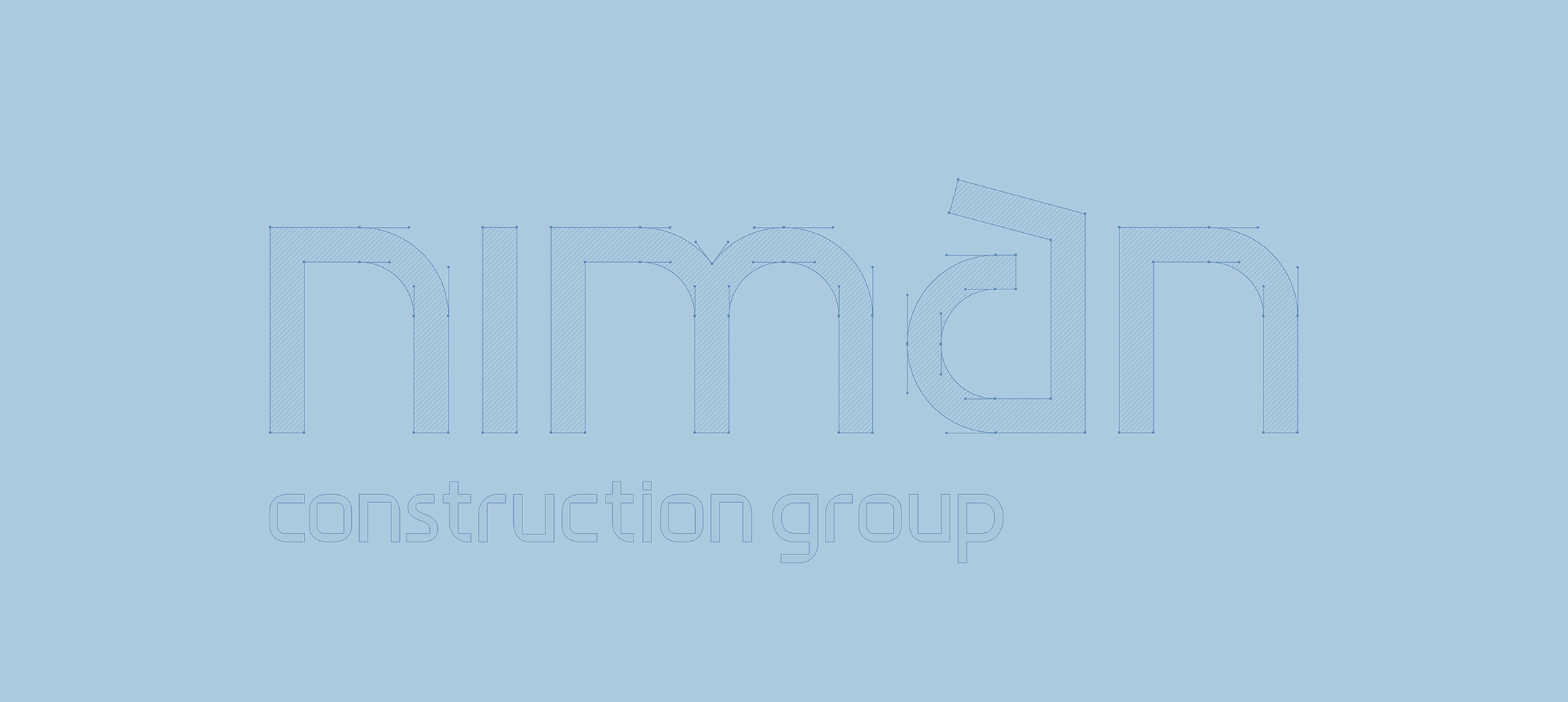
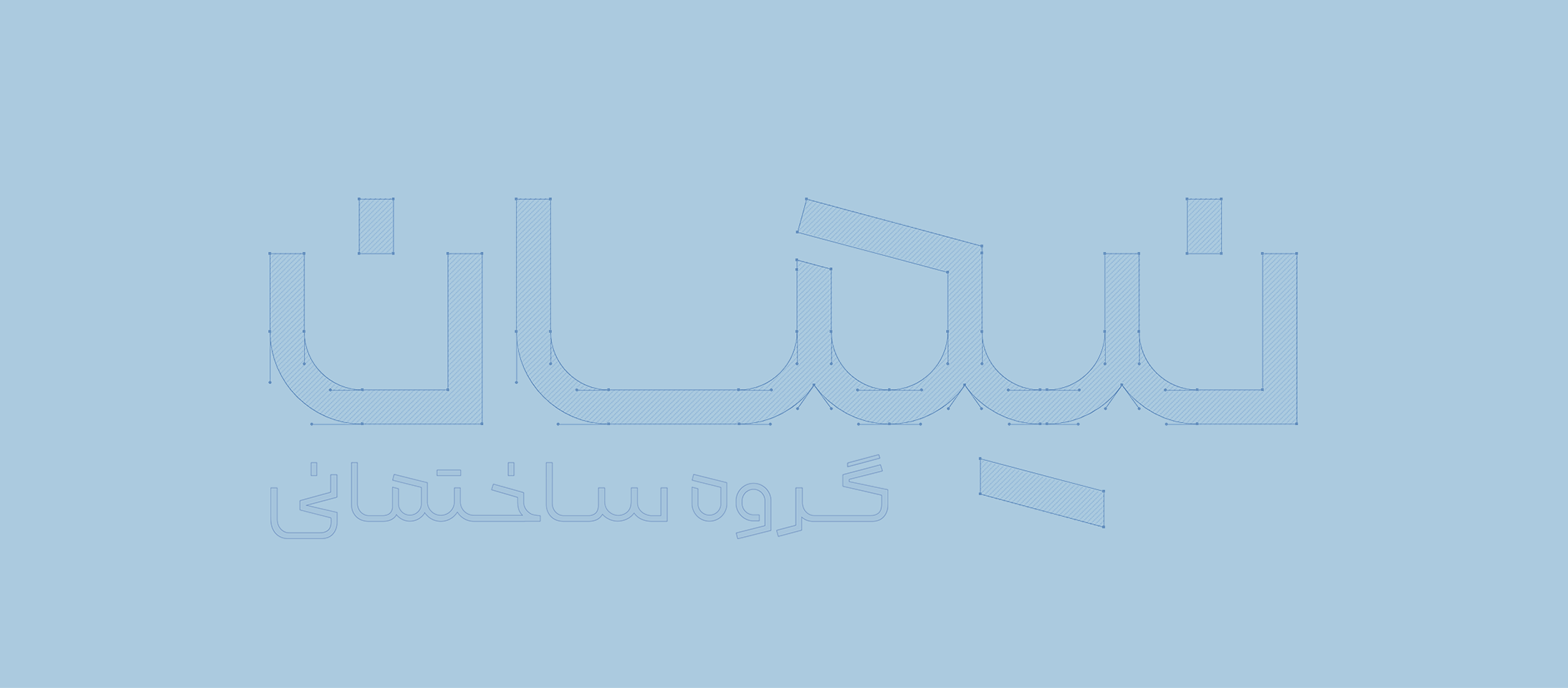
The first step was naming. “Niman” was formed by combining Nima (meaning renowned) and Mān (meaning home); together, it signifies “the home of the renowned.” This identity was reinforced by the tagline “As Enduring as a Name”, which tied the brand’s essence to durability and permanence.
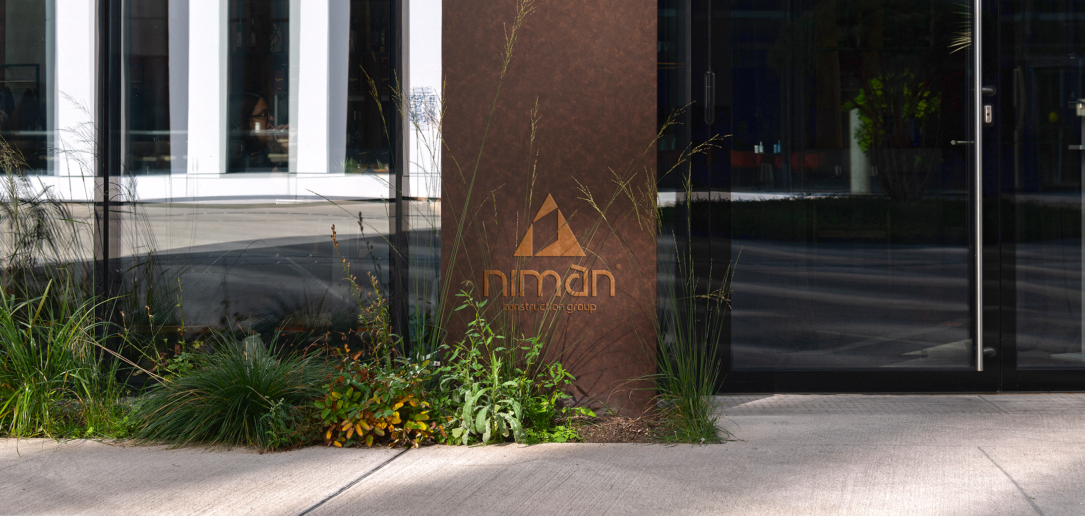
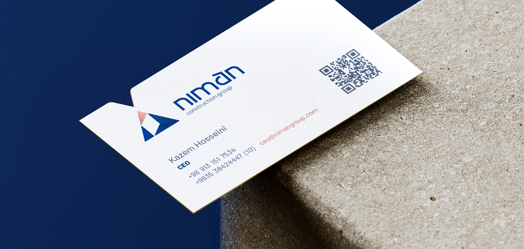
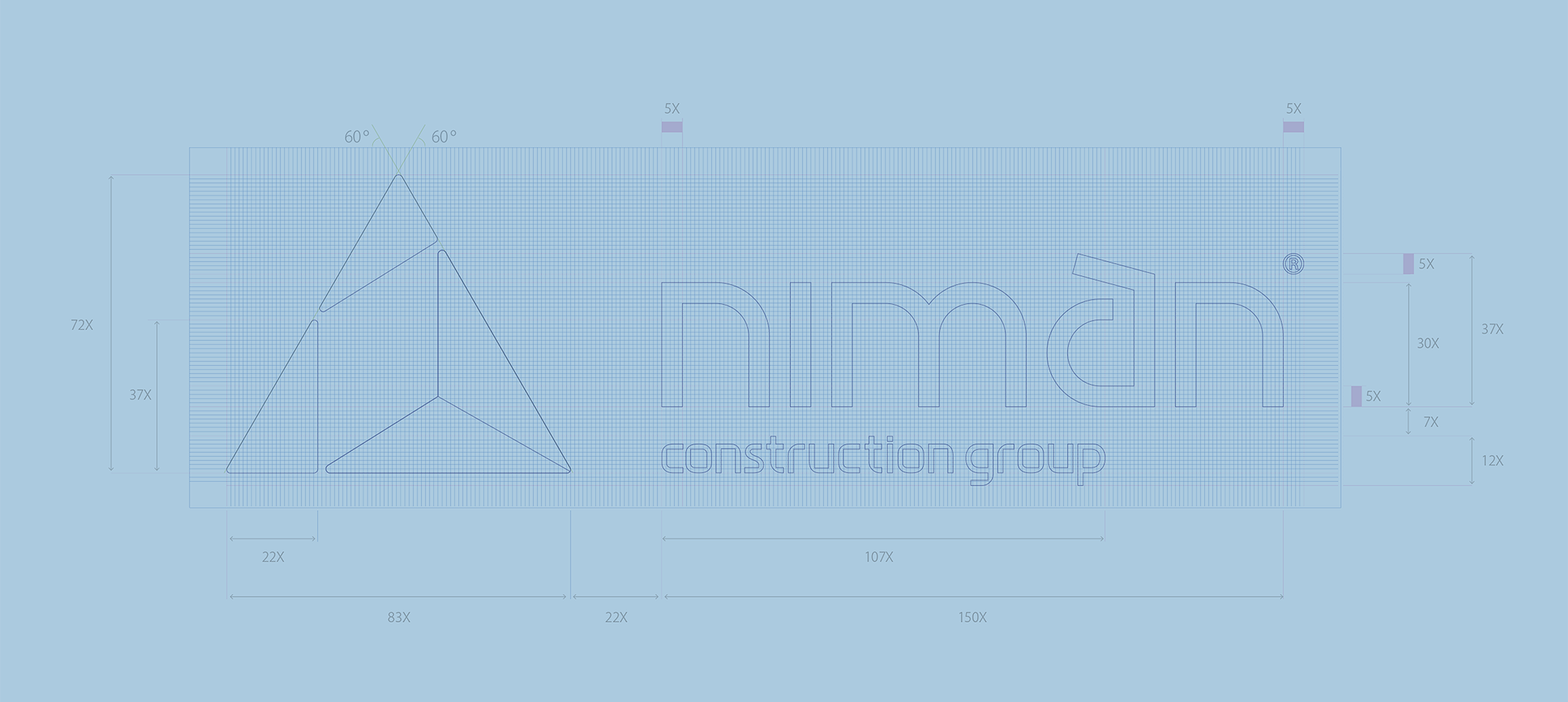
In designing the visual identity, the logo became a multi-layered visual metaphor: Its solid triangular form, inspired by the shape of a mountain, reflected integrity, commitment, and authenticity. The upward structure conveyed the promise of sustainable growth and secure living, while the subtle reference to the letter “N” evoked the brand’s name and tagline.
The negative space within the triangle also suggested a roof under which innovation and value creation take place, a metaphor for the homes Niman builds for the future. In this way, the logo became the distilled essence of brand strategy, creating a bridge between verbal and visual identity.
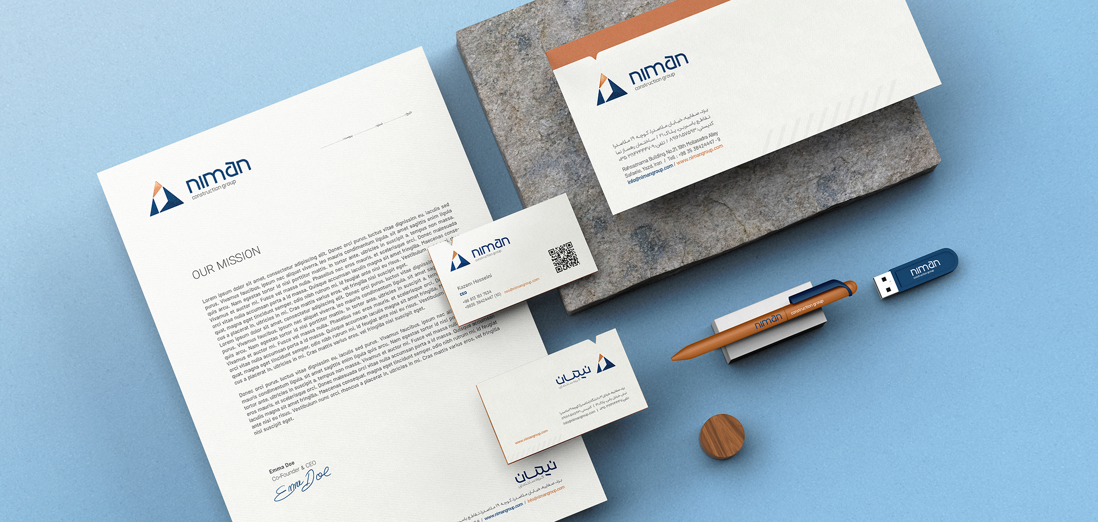
The color palette further articulated this duality: Navy Blue conveys trust, solidity, and authority (Ruler), while metallic Copper Orange adds energy, creativity, and a sense of luxury (Creator).
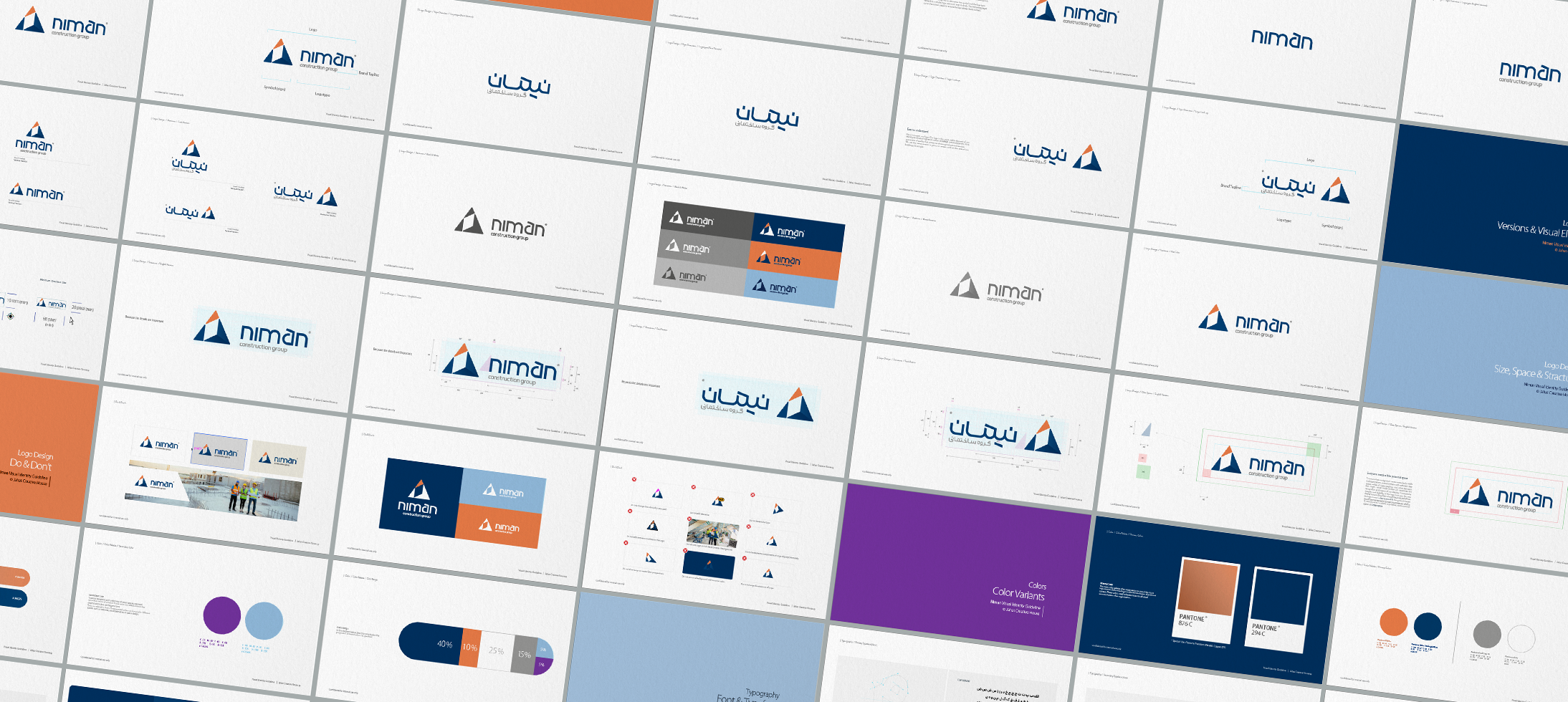
The brand’s visual language was designed to remain powerful and recognizable even within construction sites and work environments. Applying the brand’s colors, minimal patterns, and geometric symbols across safety helmets, protective tapes, site fences, and engineering equipment ensured that Niman projected a professional and cohesive identity at the very heart of construction projects.
The identity was further expanded into representational and communication spaces: from stationery and ID cards to urban billboards and environmental advertising. This multi-layered presence allowed Niman to be perceived not only on construction sites but also in the minds of investors and end users as a unified, modern, and luxurious brand.
Thus, Niman successfully bridged the legacy of Rahsaz Nama’s integrity with the expectations of today’s residential market, creating a brand designed to endure.


The brand’s visual language was designed to remain powerful and recognizable even within construction sites and work environments. Applying the brand’s colors, minimal patterns, and geometric symbols across safety helmets, protective tapes, site fences, and engineering equipment ensured that Niman projected a professional and cohesive identity at the very heart of construction projects.
The identity was further expanded into representational and communication spaces: from stationery and ID cards to urban billboards and environmental advertising. This multi-layered presence allowed Niman to be perceived not only on construction sites but also in the minds of investors and end users as a unified, modern, and luxurious brand.


Outcome
Thus, Niman successfully bridged the legacy of Rahsaz Nama’s integrity with the expectations of today’s residential market, creating a brand designed to endure.
The new identity allowed Niman to immediately differentiate itself in the crowded residential construction market and be recognized as a credible player in the luxury housing sector.Unlike many competitors who relied on generic identities and repetitive visuals, Niman employed a minimal, modern, and luxurious language that resonated directly with both investors and end users.